Chart Helpers in the Artefacts Toolkit
The Artefacts Toolkit Chart helpers are designed to help you with visualising data received from topics while running tests.
Import with:
from artefacts_toolkit.chart import make_chart
Functions
Function Reference
make_chart
Creates an interactive HTML chart based on data from two provided topics.
make_chart(
    filepath,
    topic_x,
    topic_y,
    axis_x_name="",
    axis_y_name="",
    field_unit=None,
    output_dir="output",
    chart_name="chart",
    file_type="rosbag"
    output_format="html"
)
Parameters
| Parameter | Type | Description | Default |
|---|---|---|---|
filepath |
str |
Path to the data file (rosbag) | Required |
topic_x |
Union[str, list] |
Topic name for x-axis. Use “Time” to plot against time | Required |
topic_y |
Union[str, list] |
Topic name for y-axis. Use “Time” to plot against time | Required |
axis_x_name |
str |
Label for x-axis. Auto-generated for single topics; recommended when using a list of topics | "" |
axis_y_name |
str |
Label for y-axis. Auto-generated for single topics; recommended when using a list of topics | "" |
field_unit |
str |
Unit of measurement for the field data (e.g., “m/s”, “rad”) | None |
output_dir |
str |
Directory where the chart will be saved | "output" |
chart_name |
str |
Name of the generated chart file | "chart" |
file_type |
str |
Type of data file. Currently supports “rosbag” | "rosbag" |
output_format |
str |
Output file type. Choose from “html” or “csv” | "html" |
Returns
None:
When output_format="html"
- Creates a plotly html chart
<chart_name>.htmlatoutput_dirbut doesn’t return any value. - Can create single, or multiple plot charts (See Example)
When output_format="csv"
- Creates a csv file
<chart_name>.csvatoutput_dirbut doesn’t return any value. The Dashboard will automatically try to convert csv files to charts upon upload. Useful when wanting to keep file sizes down. - Please note that the dashboard can only currently automatically create single topic charts.
Note
- Currently only supports creating charts from rosbags
- When using “Time” as one of the topics, the function will automatically plot the other topic against that topic’s timestamp if available. If the topic does not have timestamps in its message structure, the rosbag’s time will be used.
Example
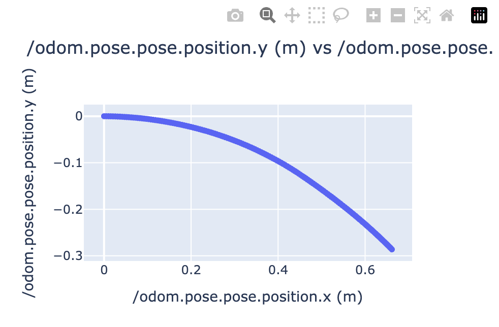
Single Topics
The following example adds the make_chart function post shutdown, i.e after the test has completed and rosbag saved.
# my_test_file.launch.py
# test code

...

@launch_testing.post_shutdown_test()
class TestProcOutputAfterShutdown(unittest.TestCase):
    def test_exit_code(self, rosbag_filepath):
        make_chart(
            rosbag_filepath,
            "/odom.pose.pose.position.x",
            "/odom.pose.pose.position.y",
            field_unit="m",
            chart_name="odometry_position",
            output_format="csv"
        )
Producing a csv file that will automatically display as a chart in the dashboard as below:
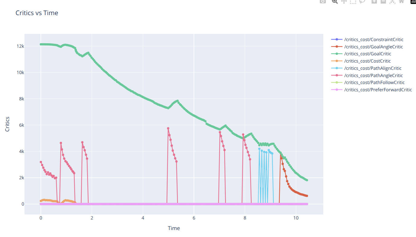
Topic vs Topics
make_chart(
    rosbag_filepath,
    "time",
    ["/critics_cost/ConstraintCritic.data", "/critics_cost/GoalAngleCritic.data", "/critics_cost/GoalCritic.data", "/critics_cost/CostCritic.data", "/critics_cost/PathAlignCritic.data", "/critics_cost/PathAngleCritic.data", "/critics_cost/PathFollowCritic.data", "/critics_cost/PreferForwardCritic.data"],
    axis_x_name="time",
    axis_y_name="critics",
    chart_name="Critics vs Time",
)
Will produce the following chart:
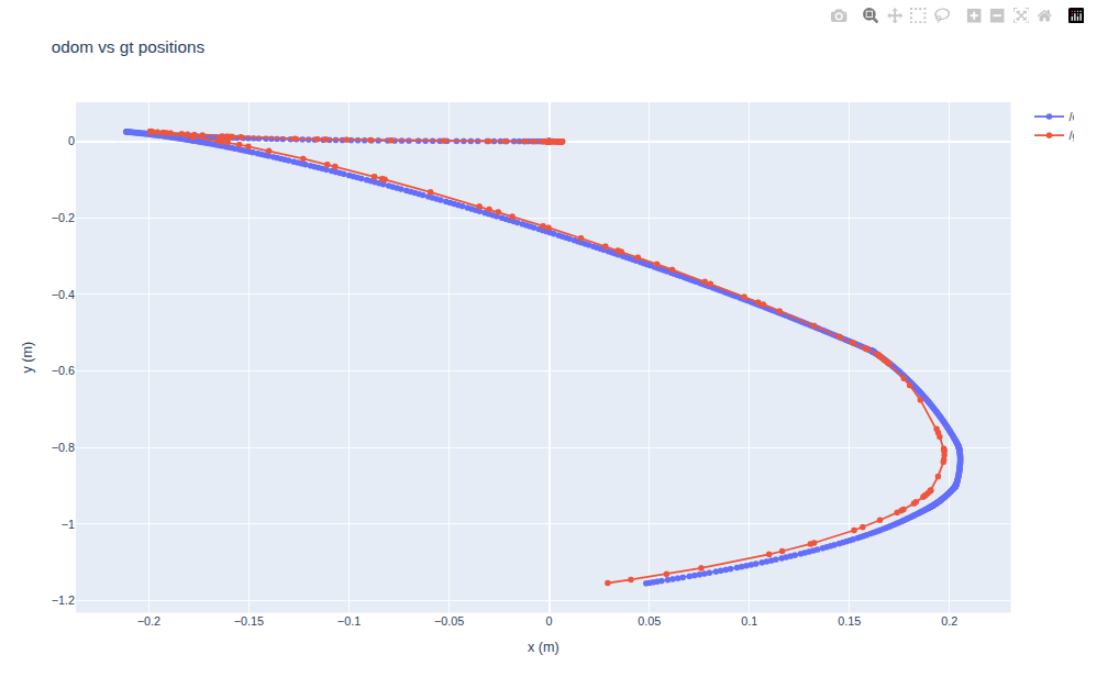
Topics vs Topics
 make_chart(
        rosbag_filepath,
        topic_x=["/odom.pose.pose.position.x", "/gt_odom.pose.pose.position.x"],
        topic_y=["/odom.pose.pose.position.y", "/gt_odom.pose.pose.position.y"],
        axis_x_name="x (m)",
        axis_y_name="y (m)",
        chart_name="odom vs gt positions"
    )
Will produce the following chart: